![]()
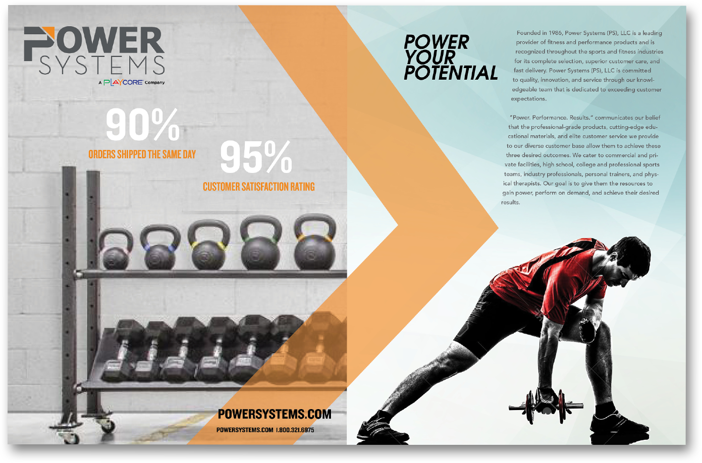
Power Systems is a fitness company based out of Chattanooga, TN, specializing in delivering great customer service to the fitness industry while offering a comprehensive suite of products.
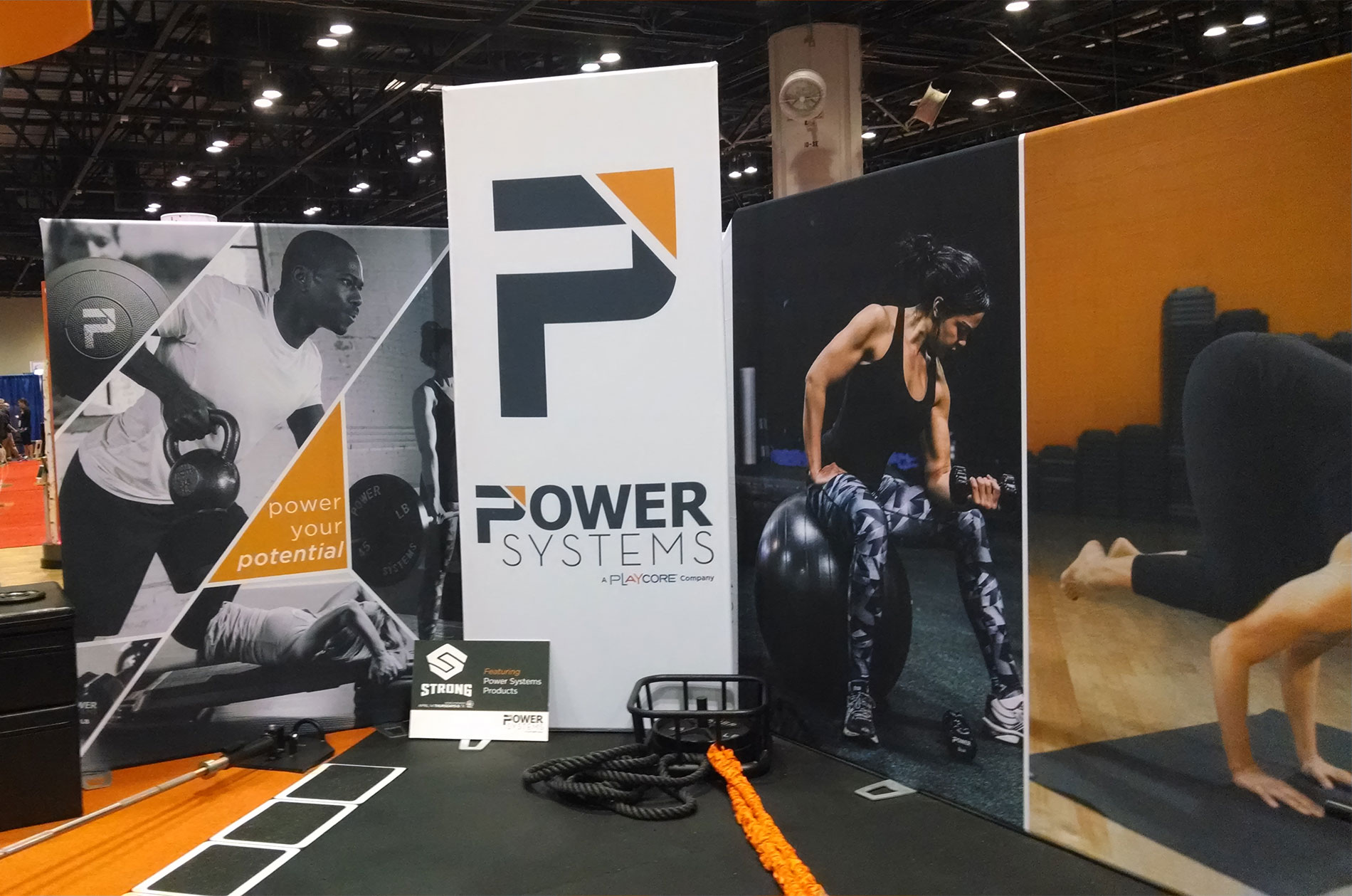
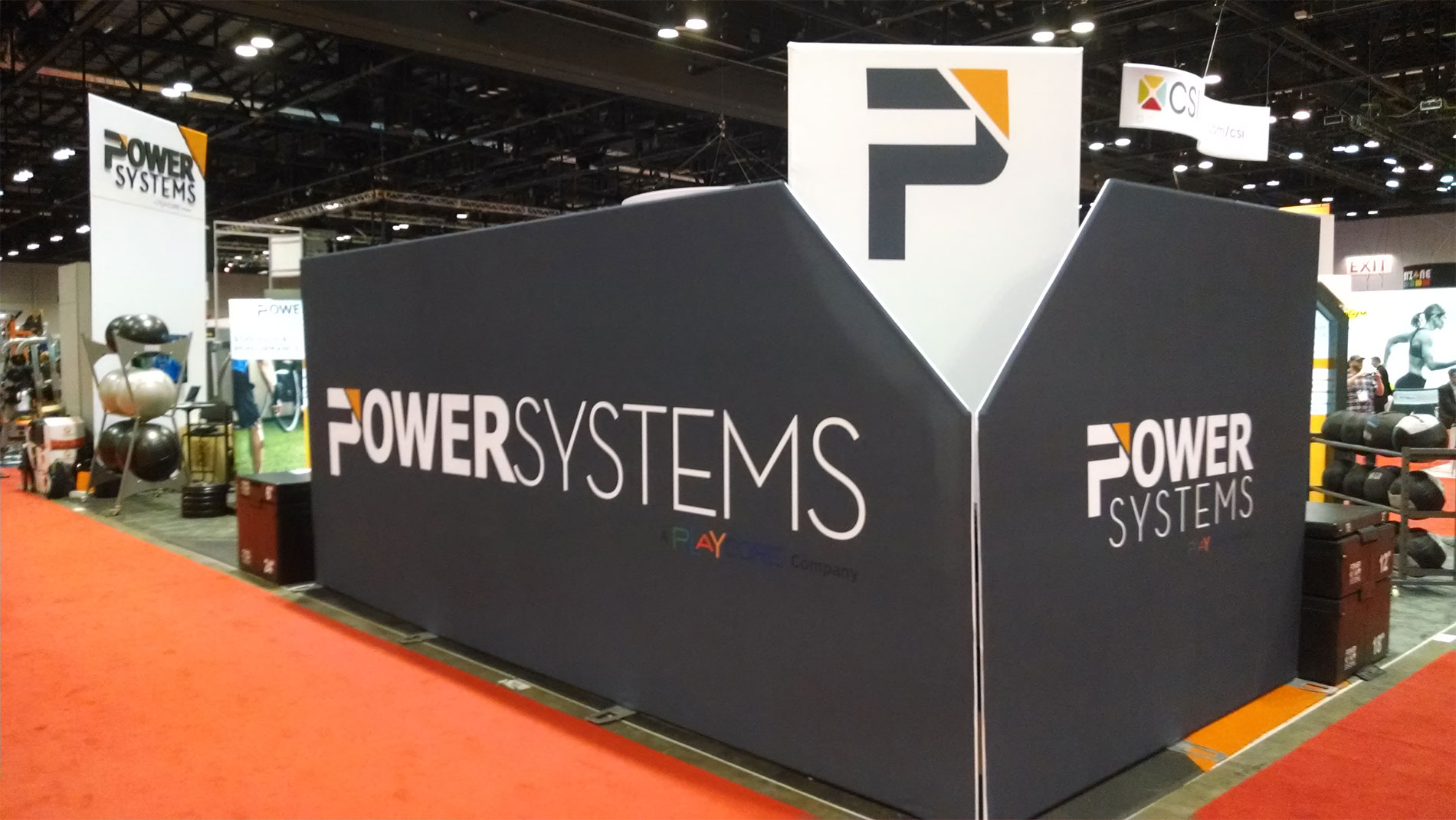
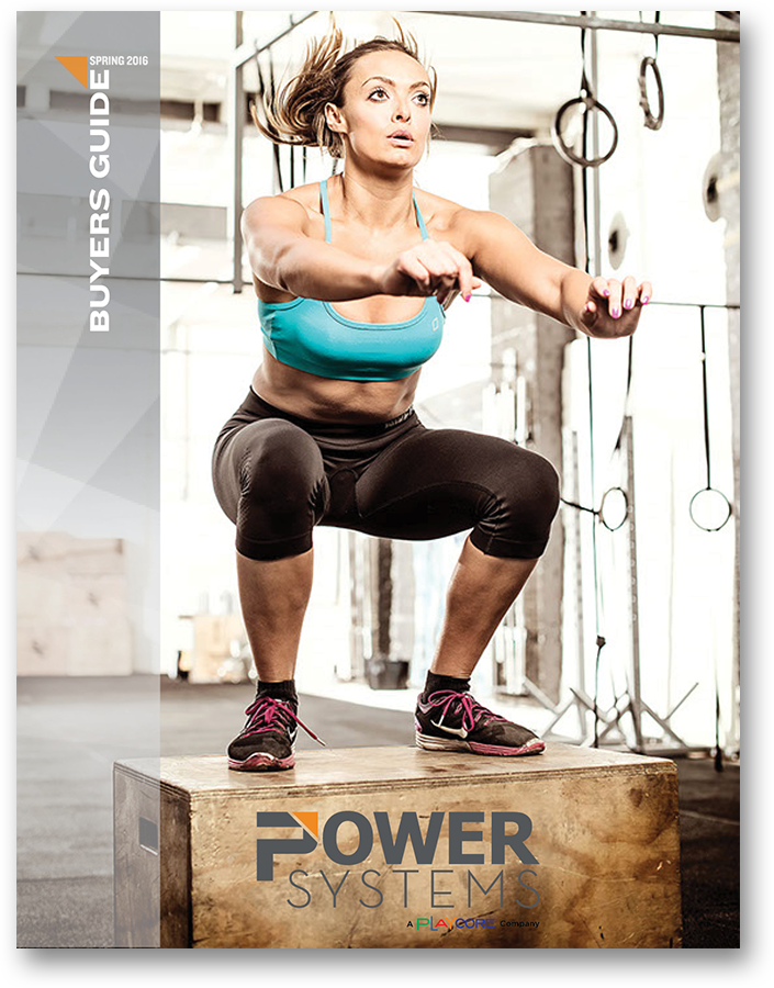
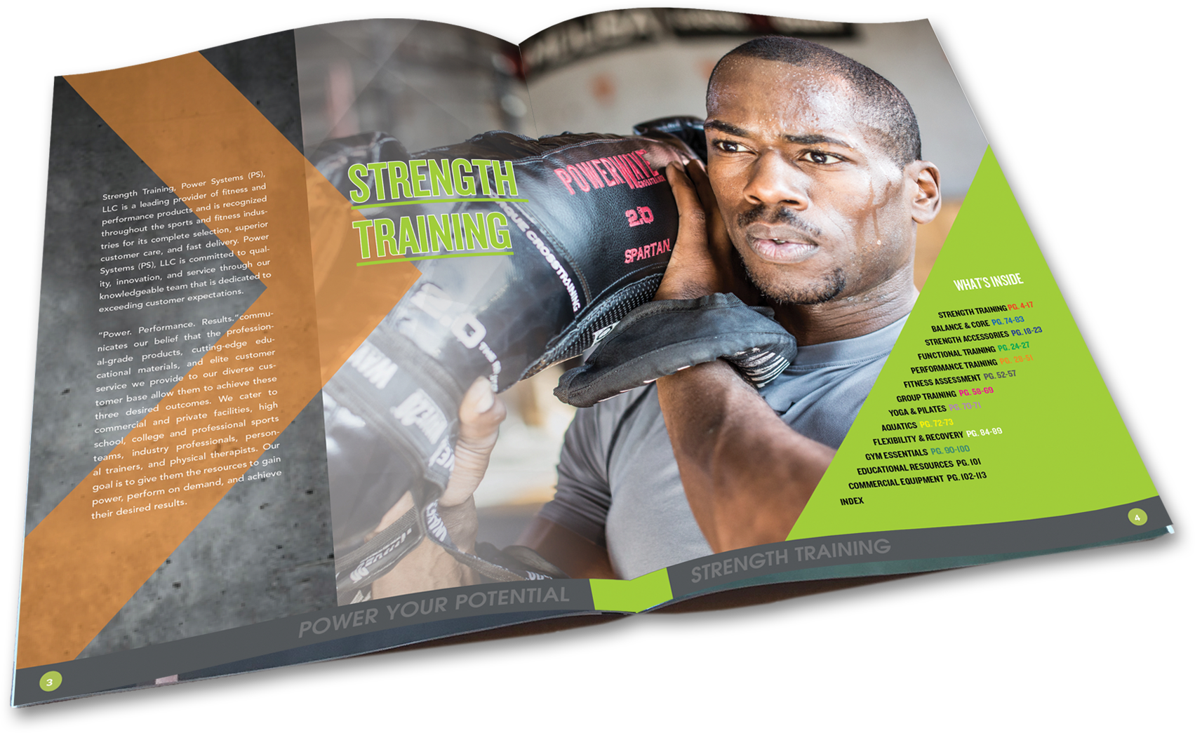
With a clear strategic direction, we created a unique positioning statement and tagline. As the company's name was not changing, we focused on creating a new mark, logo, brand colors, fonts and new photography to capture the brand in motion. We then brought the brand to their catalog and redesigned it, inside and out.
The new brand was unleashed at one of the largest fitness expositions in the country, the Florida Fitness Expo. The brand created a big buzz among its competitors and within the company.