From a young age, when he loved making art, John Scapes knew he’d be an artist. Becoming a designer was a natural fit.
After getting his Bachelors at Illinois State University, John has spent 23 years in the industry, with nine years in the in-house agency at Discover®. He’s done a little of everything, from designing, art directing and producing Pre-K–16 text, trade books and educational materials to his in-house work.
At Discover, he infused the unique Discover brand energy into campaigns along with creating a wide range of materials such as print, direct marketing, digital, video, point of purchase and collateral. John’s work has been recognized by the Print’s Regional Design Annual, Graphic Design: USA, the Chicago Book Clinic, IHAF Awards and, recently, the ADDYs.
We sat down and asked John to talk a little about font selection and usage, a big part of every design.
Q: A softball to start: If you were a font, what font would you be and why?
A: Futura. It’s a sans serif font that’s clean and crisp. Like many fonts, it has multiple weights. It can be bold and strong, yet light and elegant at times.
Q: How has typography changed since you started in design?
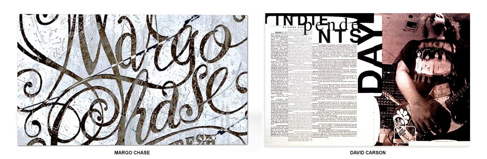
A: It seems there are more hand rendered specialty fonts, and type being used as an art form. From Margo Chase’s ability to create her own fonts per project, or to David Carson “pushing the limits” of readability in Ray Gun magazine, it seems there is no end what one can do with typography.
Q: What are some of your favorite uses of type in the market right now?
A: I love the way a blocky san serif font can be used. I enjoy seeing the words stacked, or used vertically. It’s always very clean and crisp.
Q: What’s your process for picking a font for a client?
A: Lots of variables here, but you’ve got to ask yourself—What is the essence or character of the client? Is the client a strong financial institution, or an elegant clothing boutique? The font should reflect the client’s brand, or it should help create the brand.
Q: What trends do you see becoming more popular in typography this year?
A: Who really knows? I think that the trends are set by certain publications and then designers follow. I still think custom fonts will be strong for display. But fonts that work well for responsive design will be popular too.
Q: How does 6AM think differently?
A: We will NOT give the client the obvious.
I ask myself what would make someone STOP turning a page in a magazine, or STOP to look up at a commercial on their TV to look at an ad? We try to accomplish what I call STOPPING POWER! I believe this will help not only differentiate the client in the marketplace, but place them in the heart of it. That is what we call SMART.
Visit our website to see John’s type at work, and to learn more about what 6AM Marketing’s creative team can do for you.